Home
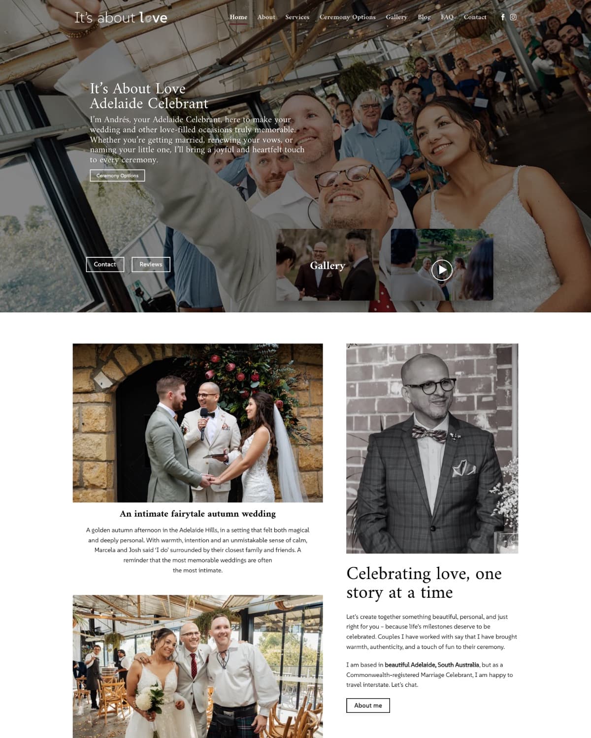
Before
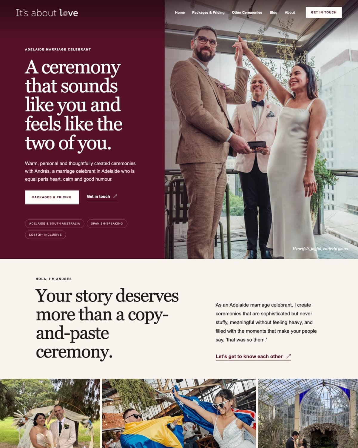
After

A closer look at the thinking behind recent projects: what the problem was, what changed, and why those changes and not others.
Case study
The old website had plenty of personality and proof, but the message, the order of things and the next step were hard to find. The rebuild kept the warmth and gave it a structure a visitor can follow.
The top of the home page, old site on the left and new site on the right, at the same size.
Before
After
The offer and the personality now come first. Each page now says what it is for before it says anything else.
Services, pricing and proof now follow an order. Each section answers the question the one above it raises, so a visitor is never left deciding where to look next.
Calls to action are visible, specific and easy to reach, and they read the same way on every screen.
The full write-up covers the challenge, the decisions and why structure came before design.
The businesses I work with look different on the surface and work the same way underneath. A customer has a need, searches, compares two or three options, and makes contact. The industry barely matters. What matters is that the owner is the person doing the work, the enquiry landing is the result they actually care about, and there is no marketing department to hand any of this to.
If anything on this page sounds like your business, that is the conversation. Tell me what is bothering you about it, and I will tell you what I would change first.